 |
 |
|
|
 |
| |
|
|
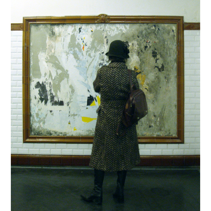 |
| I was wandering through several stations on this day and as I headed up the stairs to exit, I noticed this woman staring at the eroded signage on the wall. She, like me, was taking time to appreciate the intricate details of the passing of time. The frame that the sign occupies gives it the feeling of a museum piece which is how I liked to consider the random signs that I ran across on my daily rides to and from work, or to and from explorations. |
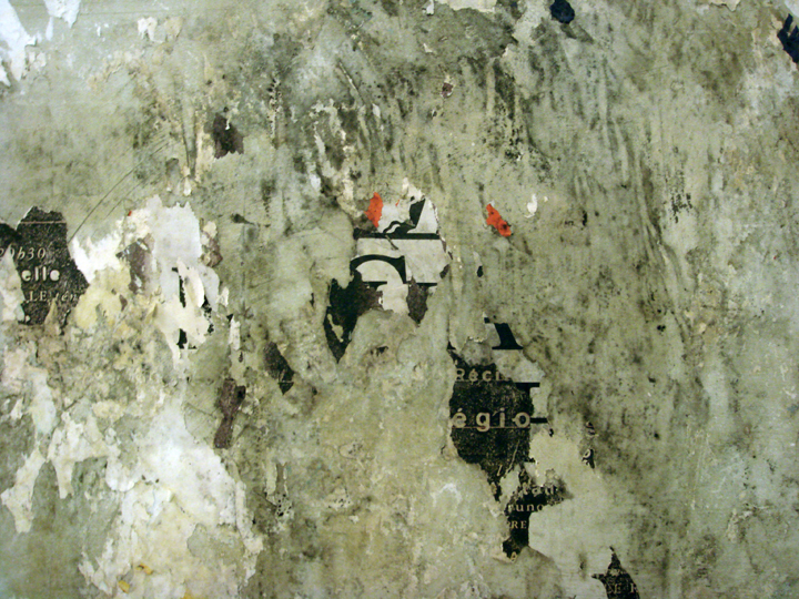 |
The woman in the previous picture had focused her attention on this billboard and the layers of time, symbols, commerce and poetry. Unfortunately I can’t remember the station where this was taken. |
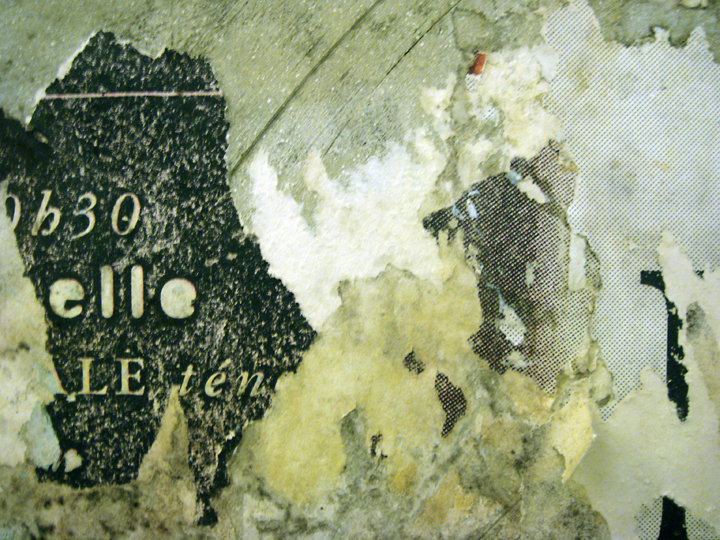 |
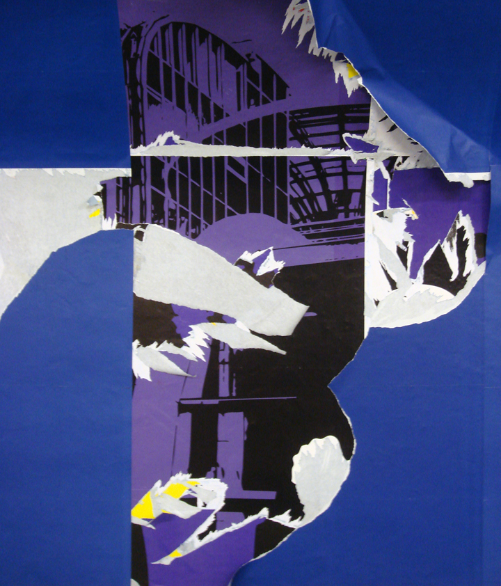
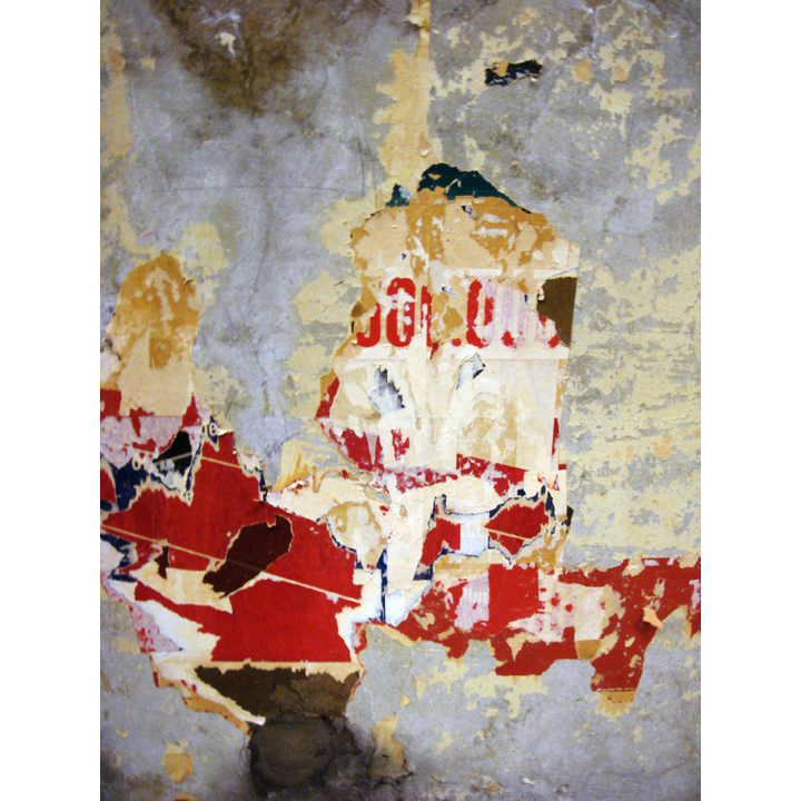
This image reminds me of an archeological find, enough information to show human existence, but not enough to piece together a story; archeology of the underground. I find most interesting the act of tearing that reduced the original to fragments; this is the most telling sign of human presence. |
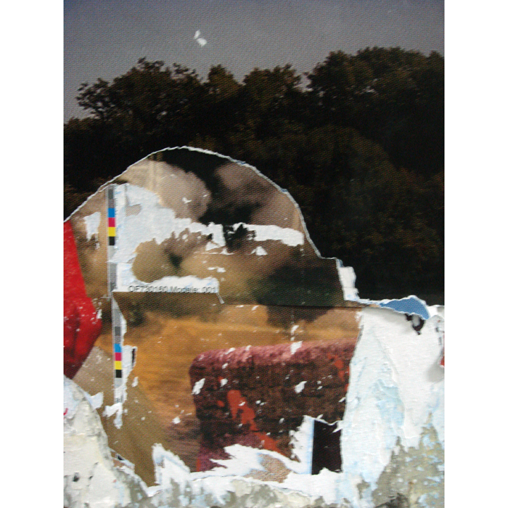 |
I love the contrast of the two outdoor scenes, one a dense tree lines meadow and the other, a barren and dusty plain. The couch in the plain gives a sense of domestication to this vast and wild place, which is also being viewed from 15 meters below the bustle of the streets of Paris. The contrasts are fantastic as are the registration marks. |
 |
A plan, a city, a body? |
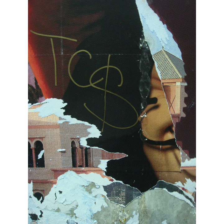 |
The architecture in the image appears as cartoonish as the digital cartoon figure himself; actually the character appears more real in this context. I think TC$ was acknowledging this preference? |
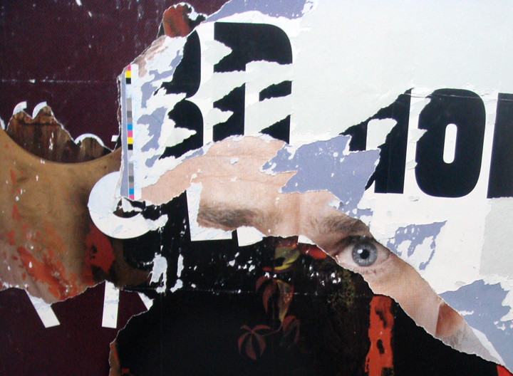 |
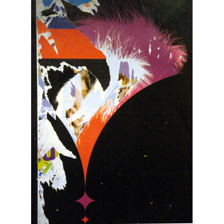
The eye is so striking that I took 15 pictures of this poster in different formats. I love how it captures a presence in what is a surface of commerce and jolts us to our senses in our everyday travels. |
 |
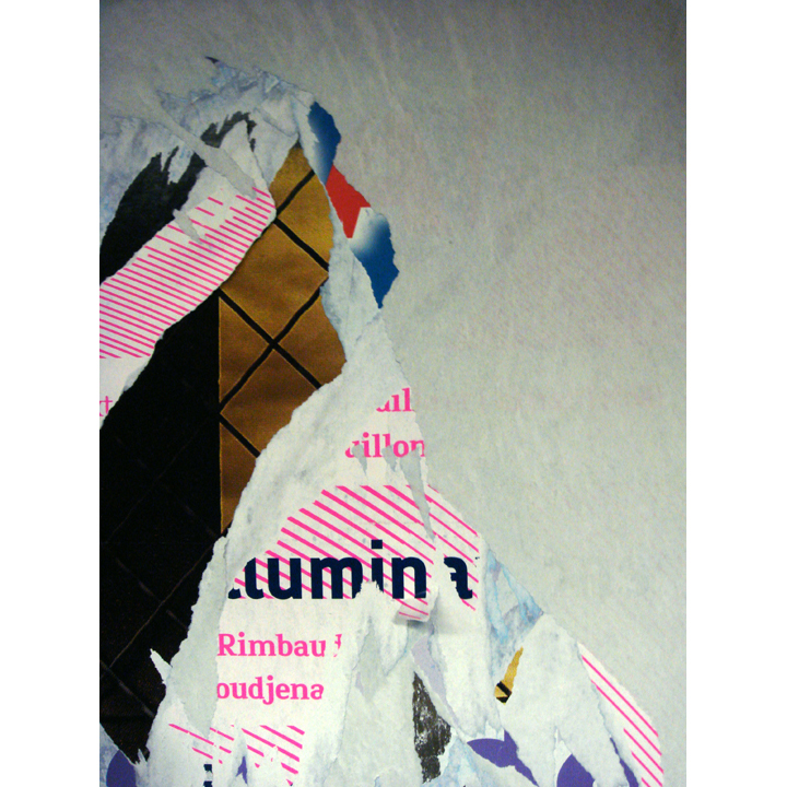
Contrasting colors, rigid and frayed edges, with arcs and arcs. |
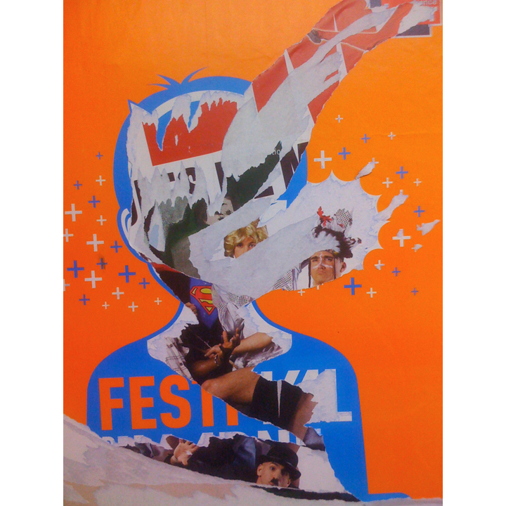 |
This kid is exploding with multiple personalities! Taken at Gare du Nord on Oct 19th, 2008 |
 |
I love the control of this image. The edges are eroded but the main image is left intact. It becomes hard to tell with the orange color, which layer is which? It’s part of the top layer but is also partially revealed leading to multiple readings that take the mid to other places. |
 |
This one I appreciate for its simplicity and the graphic quality of the neon diagonal lines. Photo taken at Les Halles Station on Jan 27, 2008. |
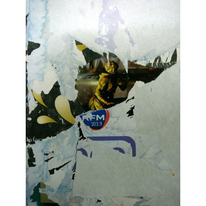 |
One of my three favorite images contained in the collection. This image expresses the violence of the tearing, the strength required and the residue left. The edges appear random but you can almost sense the tearing actions that leave the golden figure in the middle unharmed by city around it. Photo taken at Les Halles Station on Jan 27, 2008. |
 |
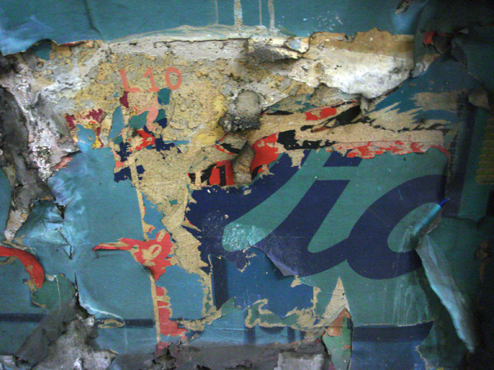
| Les Sablons Station was a gold mine on the day I passed through. I was heading home from work and it was late, so I just wanted to go eat, but I had to stop for more than a half hour to document the station. It was under renovation at the time and they had removed the inner most layer of construction revealing signage from the past 30 years or more. It’s a combination of old and new prints with the water damage that many years in the underground have wrought. |
 |
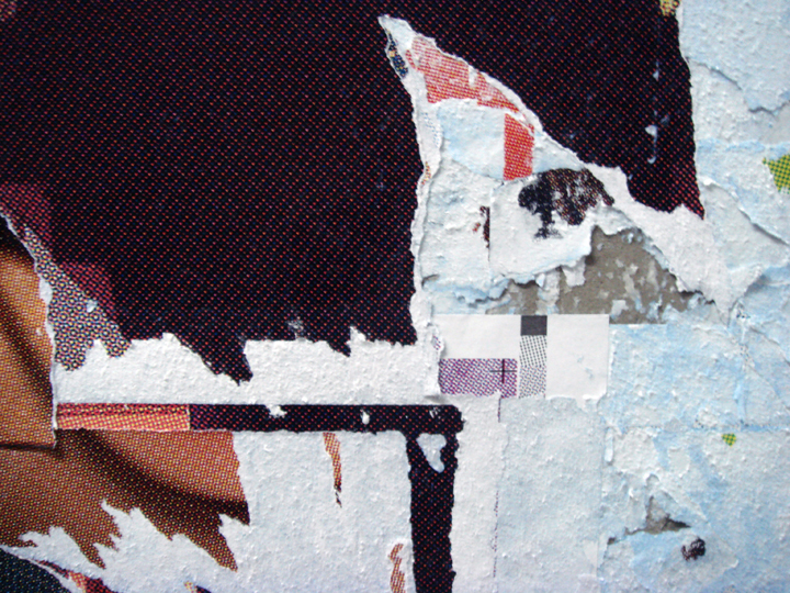
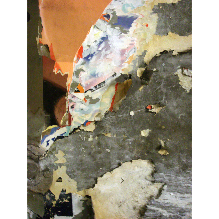
The colors here were fantastic. The pink and red with the contrasting blues and the soft yellow color as a foil, the wall itself is three dimensionalized. |
 |
This one is pure contrast. Large portions unharmed with small, multi-layered and colored areas that are ripped as if in one pull. Photo taken at Les Halles Station on Jan 28th, 2008. |
 |
I can’t help but think of the paintings of Le Corbusier, the French (Swiss born) Architect and artist. His paintings were bold in color and graphic where the lines did not contain the color, but appear as almost secondary bodies. The graphic of the lines and the silhouettes of color make this image strong in it’s new but unintended context. |
 |
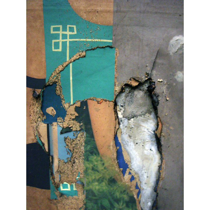
I was drawn to this photo because of the multi-layered image in contrast with the beauty of the raw concrete wall, keeping the whole composition in balance. |
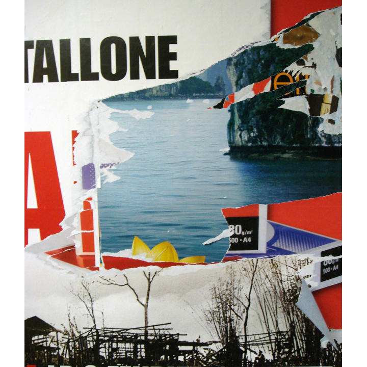 |
St-Michel Station, just across and under the river from Notre Dame Cathedral provided the most visually striking and contemporary imagery in one stop. John Rambo and the POW camps is a striking contrast to the beauty of the water behind. It’s as though someone wanted to reveal this beauty with one pull at the edge of the movie poster. |
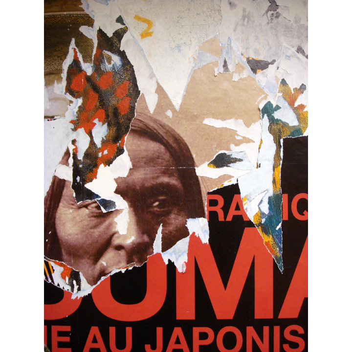 |
Perhaps my favorite find in the metro poster series. The conflicting times, nations and histories are captured in early photography, brush strokes of paintings and modern graphic font. Large portions that are untouched in contrast to the small details of the ripping at the top most layers. Like in the image early in the series, the eyes within draw our attention and pull us out of our daily commute. Photo taken at St-Michele Station on Jan 26th, 2008. |
| |
|
|
| MAIN Menu |
|
© Martin Summers 2012 |